Threlte 3D-Dataviz Tutorial
Part 2: Adding labels
Labels make it easier for users to understand data visualizations by using text to reinforce visual concepts.
Labels are traditionally used to label axes and legends, however, they can also be used inside of data visualizations to communicate categories, values, or annotations. Where possible, labels should be used instead of legends or tooltips to make it easier for users to understand data visualizations.
Threlte Text
Threlte Text is a component that allows you to render text in your three.js scene.
It parses a font file like .ttf, .otf or .woff and generates signed distance fields (SDF) for each character.
Geometries are then generated and you can pretty much use the same props that we used before like, position, color, material, rotation and so on.
Adding a title to our scene
Lets start by adding a title to our scene by creating a title component.
To begin, we should import the Text component from the @threlte/extras package.
Next, to display the text, we need to specify a font. You have the freedom to choose any font you prefer, whether it is obtained from a URL or a local font file.
This is how a basic title component would look like:
#Title.svelte

            <script>
                import { Text } from '@threlte/extras';

                // import the font
                // const font = 'https://fonts.gstatic.com/s/raleway/v14/1Ptrg8zYS_SKggPNwIYqWqZPBQ.ttf';
                const font = './Fonts/Raleway-Regular.ttf';
            </script>

            <Text>
                text="Heathrow Rainfall"
                position.y={12}
                color="#230612"
                fontSize={1}
                font={font}
            <Text>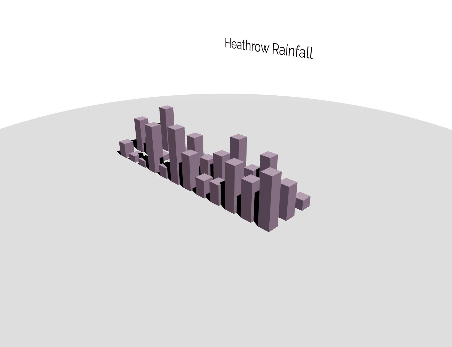
Pretty cool right? But we can do better. Lets add some more styling to our title.
Lets increase the font size, change the position and add some rotation to face the title towards the camera.
#Title.svelte

            <script>
                import { Text } from '@threlte/extras';

                // import the font
                // const font = 'https://fonts.gstatic.com/s/raleway/v14/1Ptrg8zYS_SKggPNwIYqWqZPBQ.ttf';
                const font = './Fonts/Raleway-Regular.ttf';
            </script>

            <Text
                text={'Heathrow Rainfall'}
                position.z={0}
                position.x={-10}
                position.y={12}
                color="#230612"
                fontSize={3}
                rotation.y={Math.PI / 4}
                font={font}
                maxWidth={17}
                lineHeight={1.1}
            />
Your scene should now look something like this:

That looks much better! If you want to learn more about the Text component,
check out the documentation.
Adding month labels
Lets add the labels for the months. We will create a new component
called MonthLabels.svelte and use the Threlte Text component to render the labels.
We will use a similar approach to the one we used for the title component but this time we will generate the labels based on the data.
Preparing the data
Our dataset contains the rainfall data for each month of the year over the span of three years.
For our labels we only need the months for one year, so we will filter the data to only include the months for 2011 and add them
to an array called datafiltered.
We can do this by using the filter function from the D3.js library and add it in our load function in the Scene.svelte.
`datafiltered = data.filter(d => d.year == 2011)`
#Scene.svelte

            let datafiltered = [];

            async function load() {
            const url= ‘https://raw.githubusercontent.com/stefanpullen/TutorialData/main/heathrow.csv’;
            const response = await fetch(url);
            if(response.ok) {
                data = csvParse(await response.text(), autoType);
                datafiltered = data.filter(d => d.year == 2011)
                }
            }

            onMount(() => {
            load();
            });
That leaves us with 12 data points, one for each month. Now that we have a subset of our data we can use it to generate the labels.
Creating the Month labels component
Similar to the Title component we will need to position the text, get the data into our component and render the text with some styling.
This time we will use props to pass the data into our component and to position the text.
We will need d for the data, x, y and z for the position of the text.
The following code shows how the MonthLabels.svelte component could look like. Feel free to experiment with the styling as you like.
#MonthLabels.svelte

            <script>
                import { Text } from '@threlte/extras';

                export let d;
                export let x;
                export let z;
                export let y;

                const font = './Fonts/Raleway-Regular.ttf';
            </script>

            <Text
                text={d.month}
                position.x={x - 0.3}
                position.y={0.01}
                position.z={z + 3.5}
                color="#230612"
                fontSize={0.5}
                rotation.x={-Math.PI / 2}
                rotation.z={Math.PI / 2}
                fillOpacity={1}
                font={font}
                anchorX="center"
            />
Adding the MonthLabels component to the Scene
Now that have our MonthLabels component we can add it to our Scene.svelte component.
We will need to pass the data and the position of the labels to the component.
Thankfully we already have the datafiltered variable that we can use to pass the data to the component as well as
the scales that we used to position the bars.
Let’s the following each loop to our Scene and don't forget to import the MonthLabels component.
#Scene.svelte

            <script>
                import MonthLabels from '../lib/MonthLabels.svelte'
            </script>

                ...

                {#each datafiltered as d}
                    <MonthLabels
                        {d}
                        x={xScale(d.month)}
                        y={yScale(d.rain)}
                        z={zScale(d.year)}
                    />
                {/each}
What we do here is we loop through the datafiltered array and pass each data point to the MonthLabels component.
We also pass the x, y and z position of the data point to the component using the scales that we created earlier.
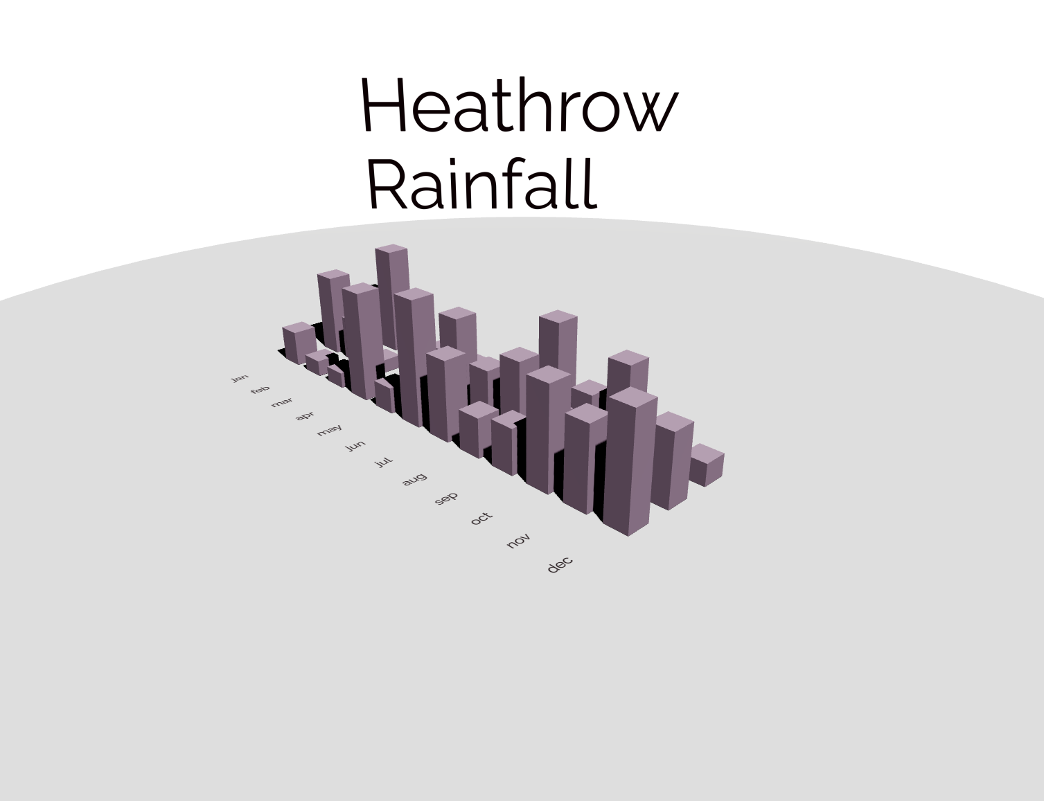
Your scene should now look like this:
Adding year labels
The next step is to add the year labels to the scene.
We will create a new component called YearLabel.svelte and add it to the scene.
This component will be similar to the MonthLabels component, but this time we will use the data to generate the labels for the years.
Preparing the data
For this we will create a new array with the years from the data in our load function as well and add them to a years array.
`years = [...new Set(data.map(d => d.year))]`
#Scene.svelte

            let datafiltered = [];
            let years = []

            async function load() {
            const url= ‘https://raw.githubusercontent.com/stefanpullen/TutorialData/main/heathrow.csv’;
            const response = await fetch(url);
            if(response.ok) {
                data = csvParse(await response.text(), autoType);
                datafiltered = data.filter(d => d.year == 2011)
                years = [...new Set(data.map(d => d.year))]
                }
            }

            onMount(() => {
            load();
            });
The years array will contain the years 2010, 2011 and 2012.
Creating the Year labels component
Similar to the Title component we will need to position the text, get the data into our component and render the text with some styling.
This time we will use props to pass the data into our component and to position the text.
We will need d for the data, x, y and z for the position of the text.
The following code shows how the MonthLabels.svelte component could look like. Feel free to experiment with the styling as you like.
#YearLabels.svelte

            <script>
                import { Text } from '@threlte/extras';

                export let d;
                export let x;
                export let z;
                export let y;

                const font = './Fonts/Raleway-Regular.ttf';
            </script>

            <Text
                text={d}
                position.x={x}
                position.y={y}
                position.z={z}
                color="#230612"
                fontSize={0.6}
                rotation.x={-Math.PI / 2}
                rotation.z={Math.PI / 2}
                fillOpacity={1}
                font={font}
                anchorX="center"
            />
Adding the YearLabels component to the Scene
Now that have our YearLabels component we can add it to our Scene.svelte component.
We will need to pass the data and the position of the labels to the component.
Thankfully we already have the datafiltered variable that we can use to pass the data to the component as well as
the scales that we used to position the bars.
Let’s the following each loop to our Scene and don't forget to import the MonthLabels component.
#Scene.svelte

            <script>
                import YearLabels from '../lib/YearLabels.svelte'
            </script>

                ...

                {#each years as d, i}
                    <YearLabels
                        {d}
                        x={9}
                        y={0.01}
                        z={0 + 2*i
                    />
                {/each}
What we do here is we loop through the years array and pass each data point to the YearLabels component.
We also pass the x, y and z position of the data point to the component using the scales that we created earlier.
Your scene should now look like this:
 You can explore the full code here, feel free to fork and remix:
The end of part 2
Great job! You have successfully completed part 2 of the Threlte dataviz tutorial.
In this section we improved our 3D visualization by adding labels and a title to our scene giving the user useful information about our visualization.
In the upcoming tutorial, we will further enhance our 3D visualization by adding animations and interactivity. These advanced features will make our visualization more engaging and interactive, enabling us to convey our data more effectively.
See you in part 3!
In the upcoming tutorial, we will further enhance our 3D visualization by adding animations and interactivity. These advanced features will make our visualization more engaging and interactive, enabling us to convey our data more effectively.
See you in part 3!